
The Password Eye Dilemma -What’s the Right UX?
Designing the Perfect Password Field: Eye Icon, Toggle, or None? Learn how top apps like Google, Facebook, and LinkedIn handle password visibility
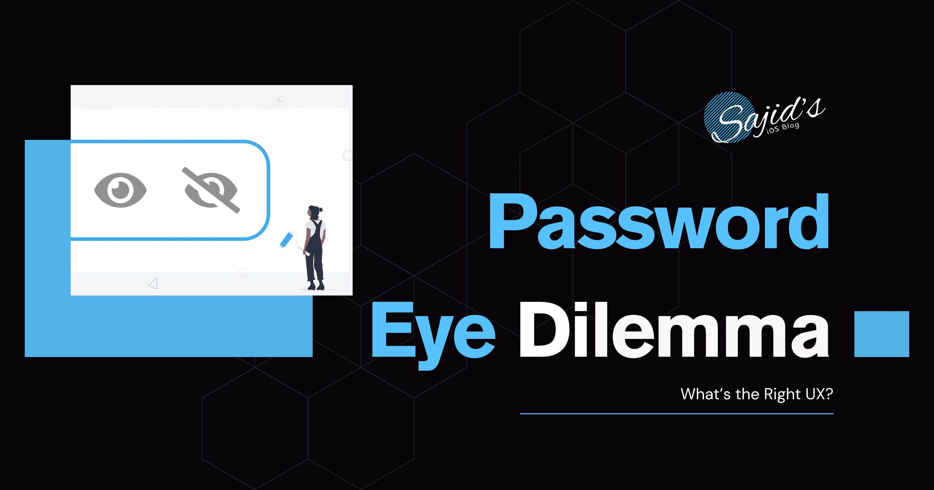
You’re working on a login screen. You’ve got the email field. You’ve got the password field. You add a simple "eye" icon to toggle visibility.
…and then the brain hits pause:
Should it be an open eye when the password is hidden?
Should it be a closed eye when the password is hidden?
What happens after the user taps?
Let’s unpack this tiny but surprisingly common UX debate.
Two Common Approaches

Option 1: Open Eye = Tap to reveal password
Eye icon (👁️) = Password is hidden → tapping it reveals password
Eye-slash icon (🙈) = Password is visible → tapping it hides password
Pros: Suggests the action.
Cons: Technically shows the opposite of the current state.
Option 2: Open Eye = You’re seeing the password
Eye icon (👁️) = Password is visible
Eye-slash icon (🙈) = Password is hidden
Pros: Matches the meaning of the icon.
Cons: May confuse users who assume the icon is a button to reveal the password.
Alternatives to Consider

Use text:
"Show"/"Hide"— like LinkedInUse a checkbox with a label (☐ Show password) — like Google
Use a toggle switch (less common but clearer)
Skip the toggle if you're using Apple’s secure autofill
What Do the Giants Do?

\Checked on July 30, 2025.*
Uses a checkbox labeled
Show passwordunder the input fieldNo icon, no visual toggle. Just plain and accessible.
Uses a text toggle button that says
ShoworHideAppears inside the password field on the right side
Uses the
Open Eye = You’re seeing the passwordapproachNo label or text, just the visual indicator
Apple & Microsoft
Do not use any visibility toggle at all
Prioritize security and assume passwords are masked for a reason
So... What’s the Standard?
Short answer: Both are technically acceptable.
Long answer: It depends on the UX logic you want to prioritize.
There’s no official Apple Human Interface Guidelines or Material Design guideline that mandates either approach, which is why different teams do different things.
However, the most intuitive and commonly accepted UX today is:
Default: Crossed eye (password is hidden)
Tapping shows password → icon switches to open eye
Optional: Add a tooltip or accessibility label for extra clarity
There’s no absolute “standard,” but consistency and clarity should always win.